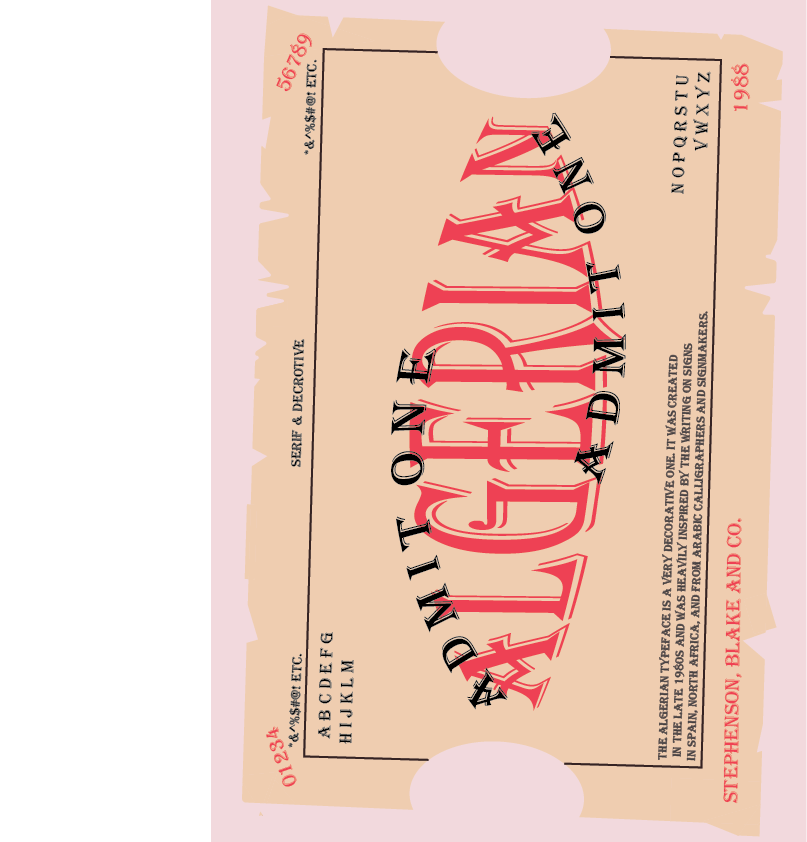
 For this assignment, we were tasked to choose a typeface and make a poster of sorts, a specimen of it. I chose the typeface Algerian. This typeface was created by Stephenson, Blake and Co. in 1988. It was created with inspiration from Arabic calligraphers, and shop signs spotted in Spain and North Africa. The font family contains more than 100 font styles and has five weights to choose from.
Personally, I would use this decorative font for, well, decoration in my writing, or if I want to make a digital vintage design. The font really pulls me in that 'vintage' direction, and that is exactly why I chose to display it in the format of a circus ticket. It reminded me of vintage circus or train tickets, and so I tried to replicate the same thing here with the layout. To achieve this, I fiddled with the shape builder tool, to make the frayed ticket shape, and the bulge and arc tool (under warp effects) to edit the text shapes themselves. Overall, this project was really fun and truly pushed my creativity to places I hadn't yet thought of before.
0 Comments
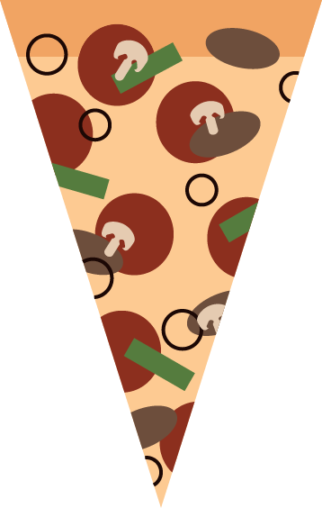 For this project, we were tasked in making a pizza slice in Illustrator. We mainly focused on vector graphics and simple shapes, rather than realistic photos and pixels and such. The program, I felt was pretty similar to photoshop, if not easier to use with the straightforward tools.
To create this pizza slice, I mainly used the shape tools (rectangle, ellipse, etc.) and the shape builder tool. This shape builder tool was used to combine and edit shapes to my will. I used this to create the mushroom and cut off the edges of some of the toppings. Overall, I enjoyed using illustrator and found it rather fun and simple to use, and I really like how my pizza turned out. I began this project by taking my tank model and unwrapping it in 3Ds Max. By this, I mean that I was allowed to gain access to different elements to help me create an unwrapped version of my model. First, I added seams to the model and tell 3Ds Max where the model should open up and flatten out, akin to how a box would unfold.. I then worked with the seams and stitched them together to other parts using the Unwrap modifier to the model. This allowed me to cherry pick certain areas and connect them together. For example, I connected the cannon together into one piece and the singular parts of the wheels were connected too. Once everything was connected and flattened and saved into a template, I opened it in Photoshop. I then colored it in photoshop using the magic wand and the fill tool. Once it was colored, I added it back onto the model in 3Ds Max using the Materials tab and a bitmap.
I liked the coloring part of the project, as it was the easiest. My least favorite part, on the other hand, was the stitching and seam making in 3Ds Max, as it caused my many technical difficulties, especially with the complexity of my model. I can most likely use this lesson in real life if I get a job in creating unwrapped models for a video game company, or something along those lines. Overall, this assignment was quite complicated and not very fun to me, but it taught me about how to use seams, stitches, and how to overall unwrap and colors models in 3Ds max and Photoshop. For this project, we were tasked in making a shipment box. To do this, I created a box primative, then made it into an editable poly. I added a modifier to the shape to make sure I didn't run into any issues when adding the materials. I then opened the materials tab to add on the images to the shape. I first created a multi/sub object and then connected a standard material to each point on the sub object. This would give me an organized and separate space to add each bitmap. I added each image to their respective materials and connected this to the box to add them on. it was then that I noticed that some of the images didn't align. To fix this, I went to the bitmaps that weren't aligned properly and adjusted their angles. Then, voila! I had made a box!
Overall, this project was rather simple and got me more accustomed to the materials tab. I'm sure that with this knowledge under my belt, I will be able to take on slightly more challenging projects or assignments. 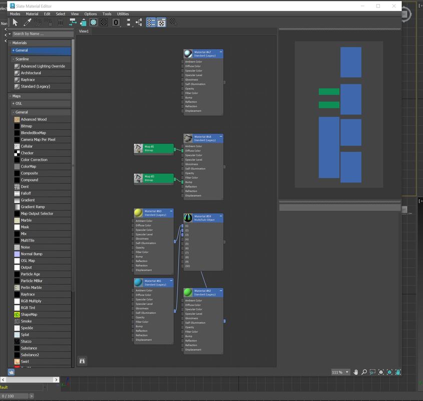 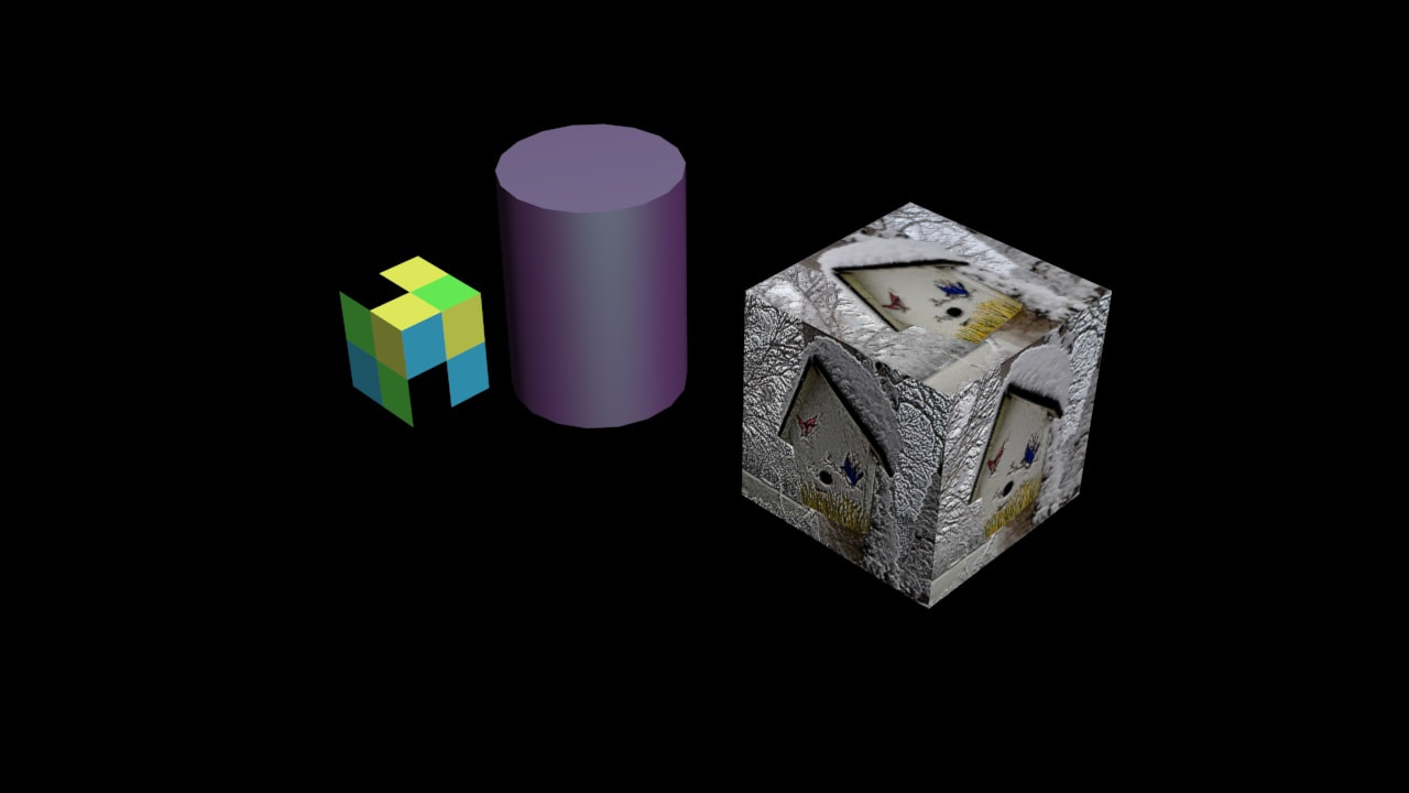 In this assignment, we were tasked to fiddle around with the material editing tab in 3Ds Max. For more specifics, we were to add a few materials to primitives: such as a bump map. We were to make a sub-object, as well.
I learned how to navigate this new tab and use the materials in it, such as bump and bitmap to add texture and patterns to otherwise bland objects/models. For example, if I was to make a package with indented text or an indented line to signify the flaps of the box, then the bump tool could come in handy. It would allow me to create depth to an otherwise flat object. Another texture that could be helpful if added, using materials, is fur or hair. The addition of this texture, especially on model of a furry creature would really make it look realistic. Overall, this project has allowed me to make my models more realistic and has helped me to expand my repertoire in 3Ds Max. Since the previous quarter, I have learned quite a lot as an artist. I have learned many composition tips in making my art more visually appealing and stronger overall. These ideas have made me really think about my art and what I want to portray in it. As for actual art skills, I learned many in Adobe Photoshop, the main software we used this quarter. While it was a little daunting, the program became quite easy to get the hang of.
As previously mentioned, in Photoshop, I learned many skills to help improve my art. These skills are as follows: Layer masking, layer adjustments, effects/filters, cropping, burning, image editing and adjustment, etc. With these tools, I would say that the quarter went by rather smoothly. I rather enjoyed the freedom we had in our projects and how we started off slow and steady and simple. Another thing I enjoyed was the addition of drawing tablets later in the quarter. Drawing tablets are a tool that I have always wished to use, and while they were a little confusing at first, it was certainly better than drawing with a mouse, and honestly made the whole experience very fun. Perhaps when I get a better hang of them -- as I would definitely say I'm still not an expert quite yet -- I will invest into my own for my future projects. On the other hand, there are parts of the quarter that I didn't enjoy, and ares that I struggled in. Something I didn't enjoy was how quickly we had to cram all these tools and skills into one composite image. It made the task feel a bit more stressful, so to speak. Also, I would say that time and lack of preparation on my end was the main setback I had, and I will do better to keep better track of pacing when it comes to my assignments in the future. I understand that missing deadlines would certainly not fly in a more professional setting, such as a Character Designer in the Animation field, or a Graphic Designer, or anything of the sorts. This is why I will certainly pay better attention to my deadlines and work, as well as using the time I have outside of class to catch up, if need be. Altogether, this quarter was very fun and unique, and the inclusion of drawing tablets definitely made it memorable. I would say that I am proud of my advancements and can't wait to see what next quarter has in store! 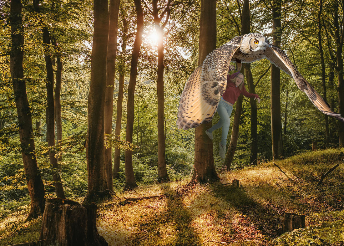 For this project, we were tasked to create a composite image, including a full body picture of us in it. To create this image in Adobe Photoshop, I mainly used tools such as layer masking, the blur tool, the burn tool, among others. The easiest part of the project was collecting and taking the images for the project. On the other hand, the most difficult part of the project was figuring out the layout and, in some cases, creating the composition itself, as quite a bit of time had passed since I used a few of the tools and I had to relearn them, mainly the burn tool. Other than this, the project was rather simple and fun! As previously mentioned, I used many tools, but primarily the burn tool and the layer masking tool. To e more specific, I used the burn tool to add shadows to my objects and below them, and I used layer masking to separate my subjects from their backgrounds. Overall, I used my knowledge in Photoshop to create a unique and interesting art piece: me being carried away by a massive bird in a forest.
Altogether, this lesson was very fun, and I wouldn't change anything about it, given the amount of freedom we had in the composition. It is surely one that I would most definitely do again if given the chance. 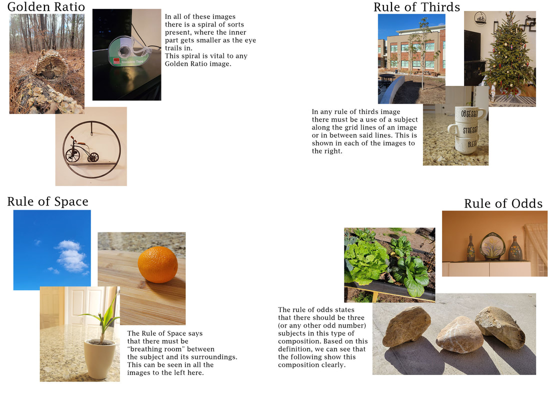 For this project, we were tasked with taking several pictures of different composition types (Golden Ratio, Rule of Thirds, the Rule of Space, and the Rule of Odds) and organizing them all in Adobe Photoshop.
Firstly, the Golden Ratio; this says that in composition, we split the "canvas" in half, with the second half being roughly 1/3 smaller than the first half. This image style usually contains a spiral of sorts in it, mainly for stylistic balance and visual pleasure. For the first photo I took to show this composition, I have displayed a log in the forest. This fallen log is littered with mushrooms in a spiral pattern and has the same proportions as the golden rule. The second image for the golden rule composition is a photo of a roll of tape. It follows the shape of the golden ratio quite well and half of it is roughly a third smaller than the rest as it moves inward. This clearly shows the ratio appropriately. The third, and final, image for this composition style is that of a shelf with a bicycle decoration in which this spiral shape and ratio are most prevalent. I would say that this one is the clearest interpretation of the composition type. Moving on to the next composition, the Rule of Thirds: where your subject is on the intersection of along the grid lines of your picture. It is the most common composition type. My first picture for this composition is trees in my school’s courtyard, all lined up on the grid lines. This follows the rules of this composition type, where the subject is lined up on the intersecting lines. The second picture is that of my Christmas tree, on the side, right on an intersecting line. This shows that it is indeed a rule of thirds. The third picture, of a few stacked cups. Like the Christmas tree, it is also to the side, on the intersecting lines. Overall, these pictures, I would say show the Rule of Thirds quite well. The next composition is the Rule of Space, which says that there must be plenty of space/breathing room around the subject. This is the case for all of the three photos I took. Firstly, the clouds are surrounded by an empty blue sky, showing this composition with the white clouds as the subject. The next picture is that of an orange, on its lonesome on a chopping board. The last picture is a potted plant, as the subject, on a kitchen counter. Overall, each picture has a subject with empty space around it, so the eye isn’t crowded with information. Finally, there is the Rule of Odds, which states that elements must be grouped together in trios (or any other odd number), creating a visual balance. My first image for this is a group of three cabbages, my second is a group of three large rocks, and my third is a group of vases/plates. Each is very balanced in terms of subjects and elements and were very easy to do. 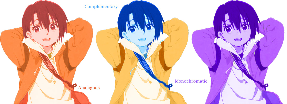 For this color study, I was tasked to take one of my favorite film or video game characters and alter their color scheme. The character I chose was Yuzuru Nishimiya, the sister of the main character Shouku. Yuzuru is a major character with mainly masculine attire. Her original outfit consists of the primary colors (red, yellow, and blue) and I altered it to be in a complementary (blue & yellow), analogous (red, yellow & orange), and a monochromatic (purple) color scheme.
For the analogous scheme, I found that the color harmonies added an element of sociability and creativity for the character, given that orange was the major color in this composition and that it is a "in your face"/"loud" color. The harmonies add an additional little "kick" to the character's common brash and defensive personality. The red of her hair also adds to the hot-headed feel of her personality. Nexthe blue and yellow, complementary, combo adds more difference to the character than the complements of the analogous combination. The blue of her face and hair adds a more mellow feel to her personality, in comparison to the yellow-orange of her clothes, giving a pop of color. Normally, she is abrasive towards people she dislikes, as a defense mechanism, and this blue color is a direct opposite to that, changing her personality and character. The same thing can be said about the monochromatic (purple) scheme, as it gives a soft, mellowness to her normally fiery personality. The altering shades/tints of purple also complement each other nicely, which I would say is a plus for this design. Overall, the changing of the color scheme of a character is crucial to their personality and traits, altering them with the color's meaning. As I completed these many color theory games, I learned how to identify certain colors and hues, not perfectly, but rather close.
For the first game, I learned about the basics of color theory - color names, color theme examples, and more. These notes will further allow me to have better ideas as to the composition of my art in the future. In the next game, I learned skills on identifying colors on a time crunch. It is due to this lack of time to find each color made it more difficult than the rest. Despite this, it will be helpful for my future as it will allow me to quick understand and pick colors for my digital art. The third game deals with ordering specific colors. Color ordering, in terms of blending colors one into the other, would be very helpful in blending in the future. Overall, all these games have taught me specifics about color theory and will be very helpful for my artistic future. |
