|
For this project, we were tasked in creating a pixel art character in illustrator. I decided to make something simple enough: an inchworm in with a leaf hat. I chose this because I wanted to make something non-human and simple and cute, so I picked a little inchworm. I also thought that it could be something you could see in an open world video game, so it fits the ideas I was going for.
While working on this activity, I learned how to appropriately create characters - in terms of design and backstory and details - and create pixel art using a variety of tools and such. The main tools used were the 'rectangular grid' tool and the 'live paint' tool. The rectangular grid tool gave me the appropriate basis for coloring, and the paint tool gave me the ability to actually color those squares/pixels. Another thing I learned, in relation to design, was color scheme and composition. It made me think about what colors fit the character (and not just about the fact that inchworms are green) and would make it stand out. A difficulty I had was figuring out the posing and blocking out the correct shapes, as I am much more used to smooth drawing styles than pixel art. Yet, it wasn't really as bad as I initially thought it would be. Overall, though, this piece was really fun to do, and really made me think on other character ideas and was just a real blast! I would absolutely do it again if I got the chance.
0 Comments
Another quarter gone so fast. Why, there is so much to talk about, but I'll keep it brief. Firstly, I would say that this has ben one of my favorite quarters by far, mainly due to the fact that we primarily worked in Illustrator, one of my favorite softwares to date.
In Illustrator, I learned an abundance of skills and tools to create unique masterpieces. Some of the main ones include the pen tool and the shape builder tool, both useful in shape creation and composition forming. At the start of the quarter, I wasn't the greatest in the software, especially with the pen tool. Yet, as the quarter grew on, the tools and software grew on me, my skills improving alongside this. I would say my favorite project, where my most progress could be seen, is the 'burger in paradise' or menu project. This assignment allowed me to work in composition and shape creation, and really allowed me to show my skill growth, in comparison to the first Illustrator assignment I made. Overall, this quarter has brought me many great projects and skills. I can't wait to see what the final quarter has in store.
Another video done! For this assignment, we were tasked in creating a video with proper fades and transitions and effects, using specific premade clips.
With these clips, I decided to make a silent film inspired video that showed a guy struggling to unlock his door, for comedy's sake. It thought it was quite humorous and had quite a bit of fun making it. While working with videos, I thought more about flow and how the clips will blend together. For example, when making movement flow and clips zoom in and out, I focused on getting the idea of movement across in the first clip, then the actual action paly though in the second. The razor tool was especially helpful when it came to this. As for difficulties, I thought that lining up everything, audio included, was a bit tricky. On the other hand, effects weren't too hard to work with. Overall, I really like Premiere, and I feel like I'm getting better with each assignment. In this assignment, I was tasked with tracing a multitude of Star Wars Logos with the pen tool in Illustrator. From starting out using the pen tool, I couldn't quite get the shapes I wanted, but now I can safely say that I have improved quite well. Through this project, I have learned how to appropriately create curves and obscure/unique shapes in illustrator using this tool - specifically with editing handle angles and lengths, and anchor point positions. While I am not the greatest at the tool, I would say it is a great improvement to how I started out.
Overall, this project was a good practice and really helped me improve my skills in pen usage in Adobe Illustrator. In this project, we were tasked to create four icons of varying complexity. These icons are all supposed to summarize a book of our choosing. I picked one of my favorite reads: The Book Thief. This classic book is set in WW2, Germany, in a small fictional town by the name of Molching. Our main character, Liesel Meminger, has been recently taken in by her foster parents, the Hubermanns. She is taught to read by her foster father, Hans, and soon ends up stealing books to read them, in opposition of Hitler's rules and obligations. Her life takes an even more interesting turn when her foster parents end up hiding a Jew in their basement...
For starters, I created a train icon, to represent how Liesel came to the town of Molching in the first place, and also where she stole her first book: by the railway line, after her little brother's death. The accordion is a symbol of hope and compassion, and it is a clear symbol of her father, who takes it everywhere he goes. The burning book is a representation of Nazi Intolerance and Censorship. It showed both the intolerance to Hitler's ideas and the blind following of them. Finally, the soldier helmet is a symbol to represent the world war itself, and is quite obvious in my opinion. To make these symbols, I used a combination of the shape maker tool, the pen tool, and the edit/effects panel to warp and change the shapes to my liking. I particularly used this to make the flames on the book and the bend of the accordion. This assignment really helped improve my skills and helped me with better composition creation. Overall, this assignment was very helpful in assisting me in getting a hang of Illustrator and its tools and I would totally do it again! 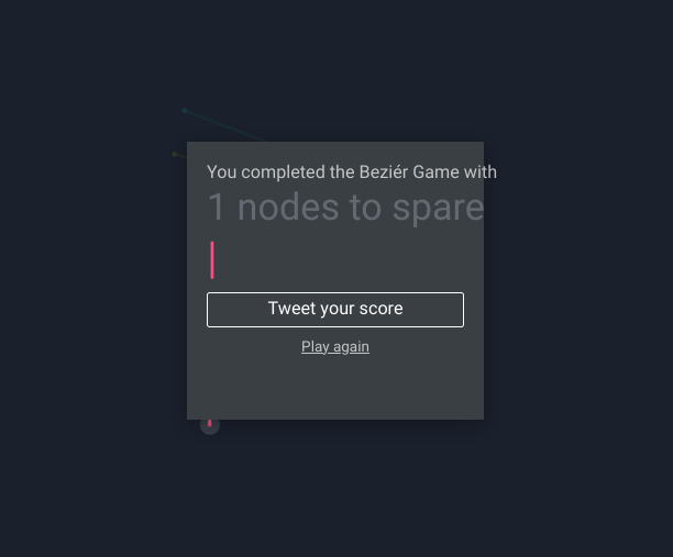 For this assignment, we were tasked in playing the Beziér game to practice with the Pen tool commonly used in Illustrator. In this game, I learned the basics of how to operate this tool. The gist is to use regular clicks to create straight lines and holding down the mouse and dragging to make curved ones. The handles bars on either side of the curved line can also be fiddled with to change the arc side and direction.
I managed to finish the game with one node to spare after a good while of struggle on the more complicated objects. However, despite the toil, I managed to get a decent hang on the tool, near the end and after a while of practice. Overall, this game was very helpful for practicing the pen tool and getting a good grasp on it, and I will certainly use the skills I learned here in Adobe Illustrator soon. 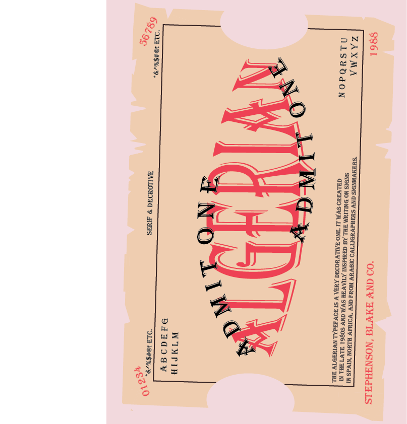 For this assignment, we were tasked to choose a typeface and make a poster of sorts, a specimen of it. I chose the typeface Algerian. This typeface was created by Stephenson, Blake and Co. in 1988. It was created with inspiration from Arabic calligraphers, and shop signs spotted in Spain and North Africa. The font family contains more than 100 font styles and has five weights to choose from.
Personally, I would use this decorative font for, well, decoration in my writing, or if I want to make a digital vintage design. The font really pulls me in that 'vintage' direction, and that is exactly why I chose to display it in the format of a circus ticket. It reminded me of vintage circus or train tickets, and so I tried to replicate the same thing here with the layout. To achieve this, I fiddled with the shape builder tool, to make the frayed ticket shape, and the bulge and arc tool (under warp effects) to edit the text shapes themselves. Overall, this project was really fun and truly pushed my creativity to places I hadn't yet thought of before. |
