Chess Piece, Wine Glass, and Nut/Bolts Modeling - using Boolean and Compound Object tools in 3Ds Max |
I began this project with prior (limited) knowledge on compound objects and modifiers, given that I had only completed two assignments prior to this one. As I progressed through this assignment, however, I was able to grasp the ropes of 3D modeling regarding compound objects and modifiers and create three unique pieces: a pawn, a wine glass, and some nuts and bolts.
I enjoyed creating the wine glass because it was the simplest to do, as the controls of forming the shape were not finnicky or hard to use. The hardest model, on the other hand, was the chess piece, as the spline modifier controls were frustratingly annoying and difficult to use, given my lack of practice in that regard. Despite this, I believe that this piece turned out really well in the final product. Some earlier skills I used to create this project include primate object building, overlapping and aligning objects, and rendering skills. I also learned new modeling skills, such as twist and lathe modifiers, the spline tool, and the correct way to use Boolean compound objects to complete this project. I can use this lesson in future modeling assignments to create more complex objects by editing their shape with Boolean and make clean and unique models. To be frank, this lesson was well designed, and I would not edit anything aside from adding a few examples of the project just so the students know what they are set to be creating and achieving. |
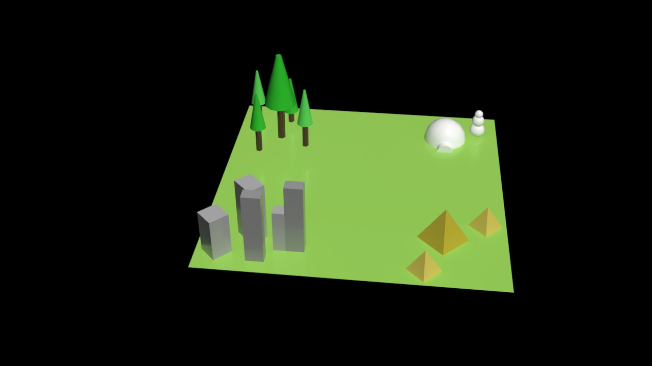
Four Corners Scene in 3Ds Max
|
In this assignment, I was tasked to create a scene with four corners, each having different shapes and objects in them.
To create the scene, I prioritized the use of the keyboard entry, parameters, the move tool, and the rotate tool. For each object, I typed in specific sizes (height, width, and length) and parameters (length, height, and width segments). I then entered specific coordinates (x, y, and z) so the pieces were laid out correctly. It was a time staking process, but proved to be fruitful. |
|
Vignette Project in Adobe Photoshop
|
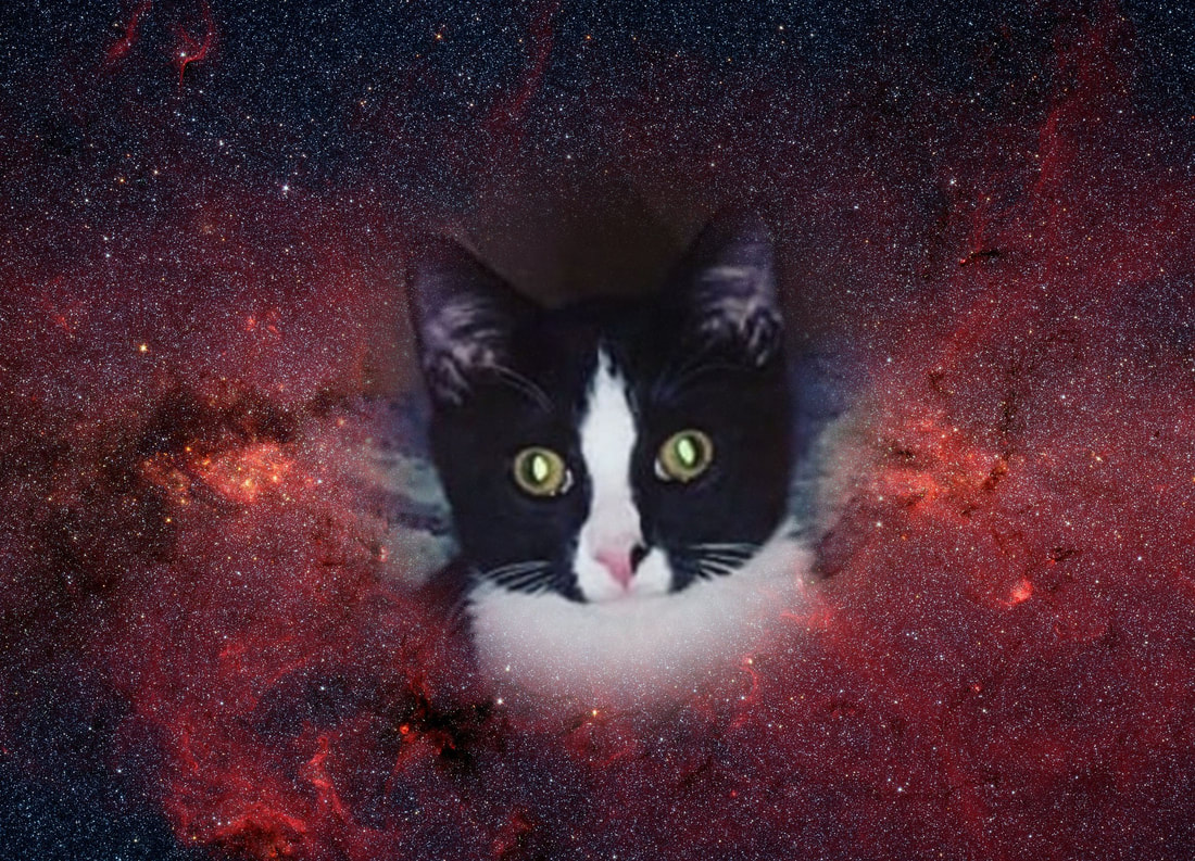
For this assignment, I was asked to create a vignette image with a unique background and foreground image. For this project, I chose a rather funny photo of my cat in an outer space background. The reason behind my selection was that my cat often looks like is lost in space in his head, so what better place to put him.
To create this blurry vignette effect, I selected the image of my cat and used the elliptical marquee tool to create an oval around my cats head. Before doing this , I adjusted the settings of the tool, making the feathering at a higher amount, specifically to 30 pixels. I then selected my cat's head and clicked the inverse of my selection. This would be what I want to hide as I mask the layer. When I clicked the mask layer tool, I was able to effectively hide the background of the photo and leave the feathered vignette part. This assignment differed from my previous assignments in terms of the new tools learned and used. Altogether, it helped me reinforce my knowledge of layers and layer masking through the major component that layer masking was in this project. Overall, this project was very fun to create and pushed my creativity and knowledge. |
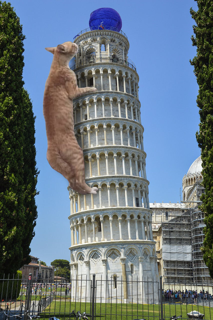
Masking Project in Adobe PhotoshopIn this Photoshop project, I was tasked to mash together two or more images, via layer masking, to create a unique scene. To be frank, I was struggling to decide what to create. I soon decided to use the Leaning Tower of Pisa as my main background piece and make it so a cat was climbing it, causing it to lean. To do this, I first opened the background image (The Leaning Tower of Pisa) in photoshop and locked it. I then embedded the cat image in. I used the lasso tool to circle the cat and cut out a majority of the background on the cat photo before using the masking tool to hide said background. I then used the brush tool to erase the edges and clean up the cat. To add the shadow, I held down the alt key, went to the masking layer and clicked the cat outline with the "Magic Wand" tool. This allowed only the cat to me selected and a new layer to be made. I then went to the new layer and filled the cat shape with black. I then transformed the shadow with the "Transform" and "Perspective" tool before blurring it with the "Gaussian Blur" tool under the filters tab. I then added the yarn ball using the same steps, except I didn't add a shadow to it.
Overall, this project was very fun and I was able to firmly grasp layer masking along with tools associated with it to make fun, unique images in Photoshop. |
|
Character Design in Adobe Photoshop
|
For this project, I created a character by the name of Laura. She is a hopeless romantic matchmaker, and is quite bad at her job.
She started her career in her early schooling, taking after her mother. But due to her clumsy and hopeless romantic nature, she couldn't hold clients for long. So she resided in a cabin in the woods with her friends and occasionally had a client or two show up. Overall, she's a very fun and outgoing character with a skip in her step (often literally) and she was really fun to come up with. Her appearance is meant to showcase her bubbly, outgoing and occasionally flirty personality. Several elements of her look (such her heart-shaped hair and the abundance of pinks and red in her outfit) are also meant to show her career. As for poses and color, I chose a pastel analogous color scheme (of red to yellow) to also represent that aforementioned cheery persona. For poses, I made a lovesick pose to show her career and hopeless romantic aspect of her personality and a perspective drawing to show her height and sweetness from her expression in that pose. In animation and film, I would bring her to life with bouncy movements in her walk cycle and have hearts trailing behind her as she walks. I understand that in animation, designs typically need to be simplified, so I would make sure to keep her hair and color scheme the same, but I would be willing to simplify the outfits. Overall this character design project allowed me to push myself with showcasing a character and their personality through poses and clothes. It was a very fun project and I would totally do it again! |
|
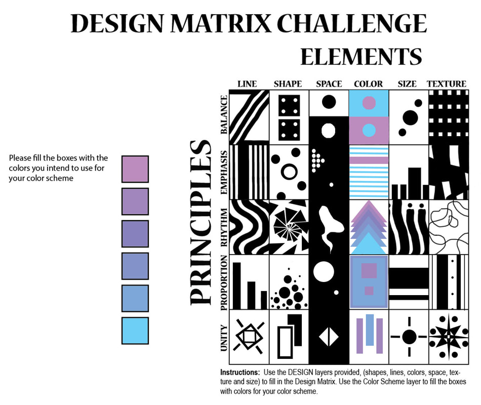
Design Matrix Challenge in Adobe Photoshop
|
If I'm being frank, this challenge was well challenging for me. I struggled with some of the boxes, more specifically the texture ones. Generally, though, I thought about how each principle worked and what was the most important aspect of the principle. For example, emphases has many differences in shapes or sizes or distances to lead the eye to a particular part of the piece. I kept this in mind and used, for example, thin lines to lead the eye to thicker ones. Some principles were easier to capture than others, such as line representing rhythm or shapes showing proportion. To go more in depth for one of the boxes, I'll take some time to talk about the rhythm principle and the texture box. When I think of rhythm and its artistic definition in regards to movement, I usually picture water. This made me think of how much texture water has in different settings. I then chose to try and recreate that texture by drawing wavy circles in varying opacities and thicknesses. Overall, this project was a bit difficult and different than what I'm use to, but it was very helpful when it came to figuring out how to compose and change my thinking about art.
|
Storyboarding Project in Adobe Photoshop
|
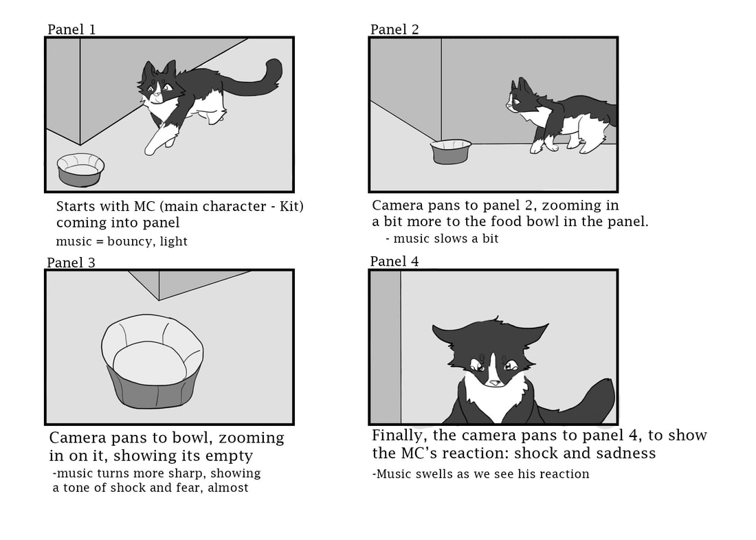
This storyboard introduces my character in my sketches as a very hungry and curious cat. In my storyboard, I decided to tell the story of my cat finding out that his bowl is empty ten minutes after eating and begging for more food, as that is a situation that occurs on the regular. I thought it was a little silly just how food oriented he was, and decided to make a storyboard about it. While sketching my storyboard, I had to keep in mind how to easily portray a situation in simple drawings. I also had to keep in mind distances and perspectives when drawing each object in each panel. To do this, I envisioned myself in the area and generally how close things would be to each other. I thought about how to portray each emotion I needed, and I would say that I did well in my finished storyboard.
|
Animated Four Corners Project in 3Ds Max
|
|
For this project, I was tasked in creating an animation of a car driving along a road in a multi-environmental scene. To make this animation, I first added in the car and road, scaling them to size. I connected the car to the spline on the road. I then affected its range of motion by adjusting the path options and clicking "Follow". To adjust its gravity, in the sense of how it travels around corners and bends, I selected the "bank" tool, and adjusted its value to make the degree in which the car tilts more realistic. I also adjusted the time values in the Time Configuration panel, so the car seemed more like it was heading on a Sunday drive, rather than in a race. I fiddled around with a few speeds and altered the car's motion to my liking, and with that, concluded the animation.
Overall, the project was surprisingly simple and really fun to do, especially when it came to adjusting the car's motion on the road. |
Cheeseburger In Paradise in Adobe Illustrator
|
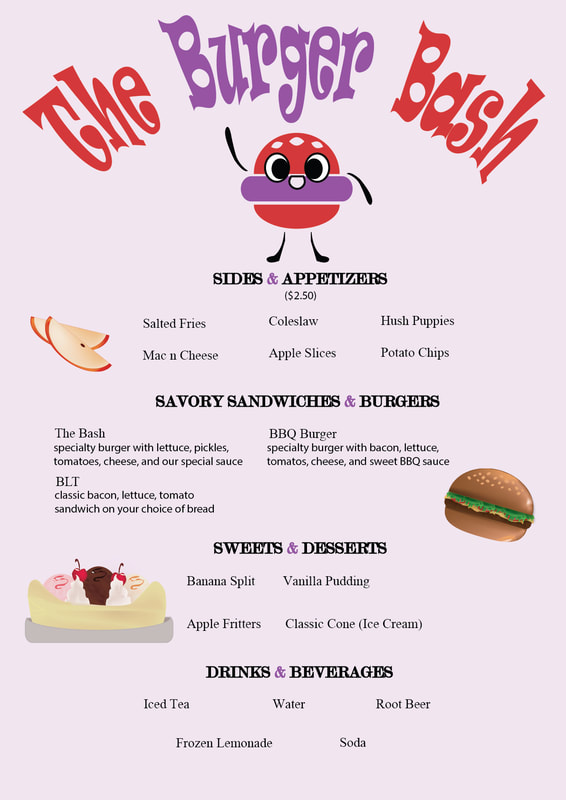
For this assignment, we were tasked in creating a cheeseburger in Illustrator, and then creating a menu with that burger and other created items, such as apple slices, in my final product, which you can see to the right.
To make this burger, and the rest of the menu items, I used a mixture of the shape-builder tool, the mesh tool, the pen tool, and a few others. The pen tool was to make more obscure shapes, such as the lettuce or the texture for the ice cream. The shape builder tool had the same objective. The mesh tool was to create shading and lighting, and overall, each tool was pretty self explanatory for use. With these tools, I created the burger, banana split, and apples seen in the menu here. The main reason I created these new objects were to showcase different shapes and proportions and tools in illustrator. To create the menu itself, I used a combination of tools, such as the text and warp tool. For the menu, I decided to go for a more retro style, including the creation of an original logo for stylistic purposes. The fonts I used are to reflect that same vintage style. My favorite part of the menu would have to be the logo, as it really ties the whole thing together. Overall, this assignment was quite fun to do and I really enjoyed creating it. |
|
Personal Project Script and Storyboard
https://docs.google.com/document/d/11YAxPggWSyg-wbmEJlojzVEpa2qAS3vphpZdsnaMOhc/edit?usp=sharing
|
|
